The new SPOTTERON version 2.7 does not only introduce the new Leaderboards (aka User Ranking) for all Citizen Science apps running on the platform, but also 2 more panels with new data statistics.
On SPOTTERON, every app gets all features of the platform without any additional costs. This principle not only made it possible to implement a full social network, push messages, an offline mode and much more advanced functionalities into every Citizen Science app, it also provides a complete and modern Citizen Science toolkit for users and project scientists alike which is bigger than all its parts. Two new extension just have been finished with the new app update version 2.7 and released for every Citizen Science project on the SPOTTERON platform: first the Community leaderboards (with their own blog entry here) and secondly the new Data Statistic Panels.
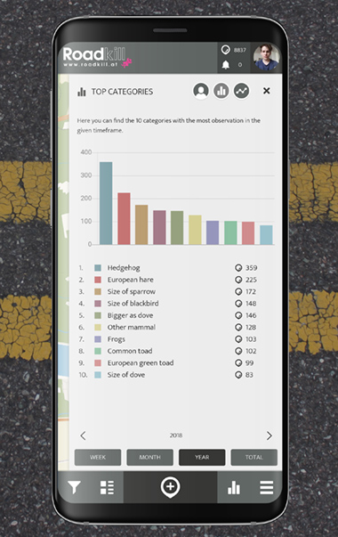
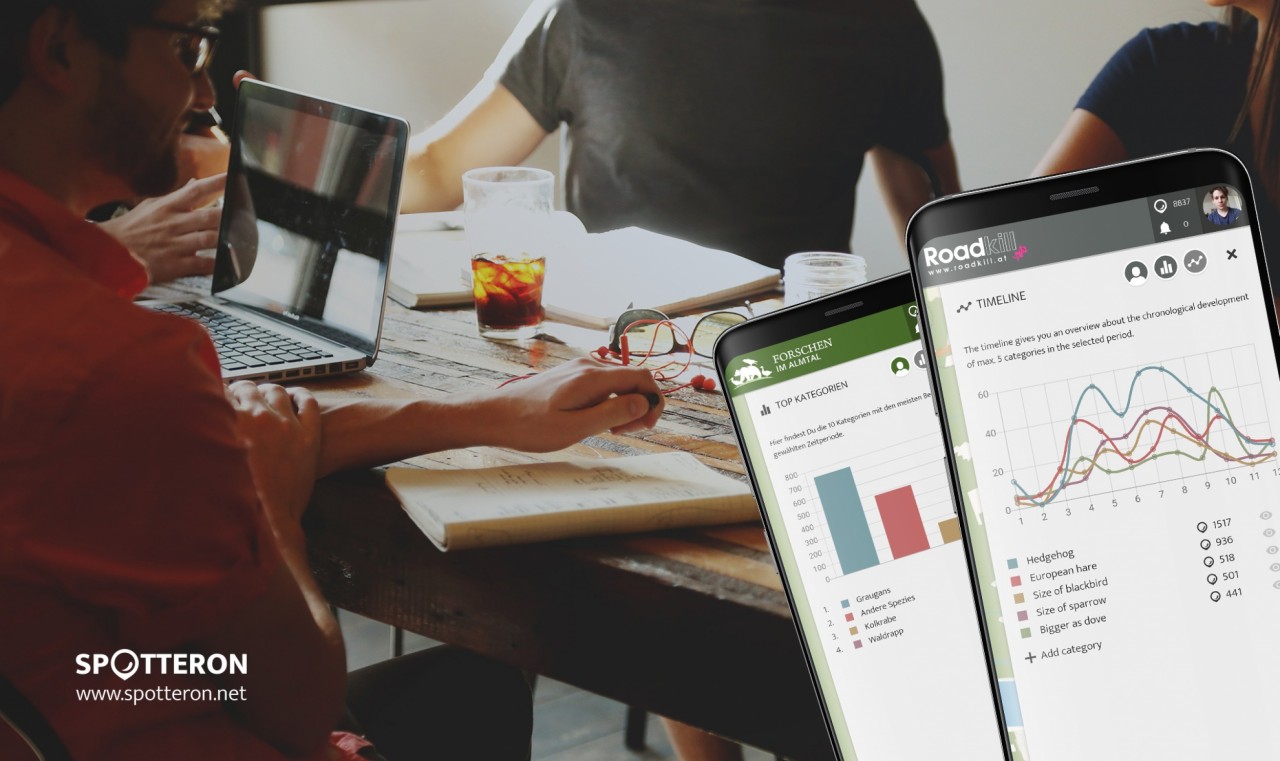
The "Top categories" panel shows which 10 categories in the app have been spotted most in the selected timeframe, while the second panel "Timeline" features a configurable display of the Citizen Scientist's contributions in a chronological way with a line chart. 5 categories from the Citizen Science app can be chosen by the users and then are displayed in form of an interactive line chart in the panel.
In this panel, Users can hide / unhide categories, which results in an instant animated update of the chart. Furthermore, the data points can be selected and the amount of observations are displayed.
For both panels, the time range displayed can be switched and the data statistics are updated in realtime. It is also possible to switch through the different time areas with arrow buttons to see data statistics from e.g. the last month or the week before.
Citizen Science Data Visualization
The new data statistics give instant feedback to all participants about what kind of species, topics or observation options are contributed through out time by the community in the Citizen Science app. Especially the "Timeline" panel can be used to explore the data on a chronological scale to see e.g. the impact of the seasons in a biology monitoring project on particular animals, fungi or plants or to explore how the project has grown until now in the "Total" time range option.

The new statistics provide a modern and visually elegant form of realtime data visualization and can be accessed in any Citizen Science app on the SPOTTERON platform with the second icon from the right in the main interface bar or via the main menue. The panels are also present in the projects' interactive web-app, which is automatically part of every toolkit package, for example directly under this link: https://www.spotteron.com/naturkalender/statistics by using the bubble buttons or by swiping the panel itself.
