Making Data Meaningful: Data Visualization Overlay in Citizen Science Apps on the SPOTTERON Platform
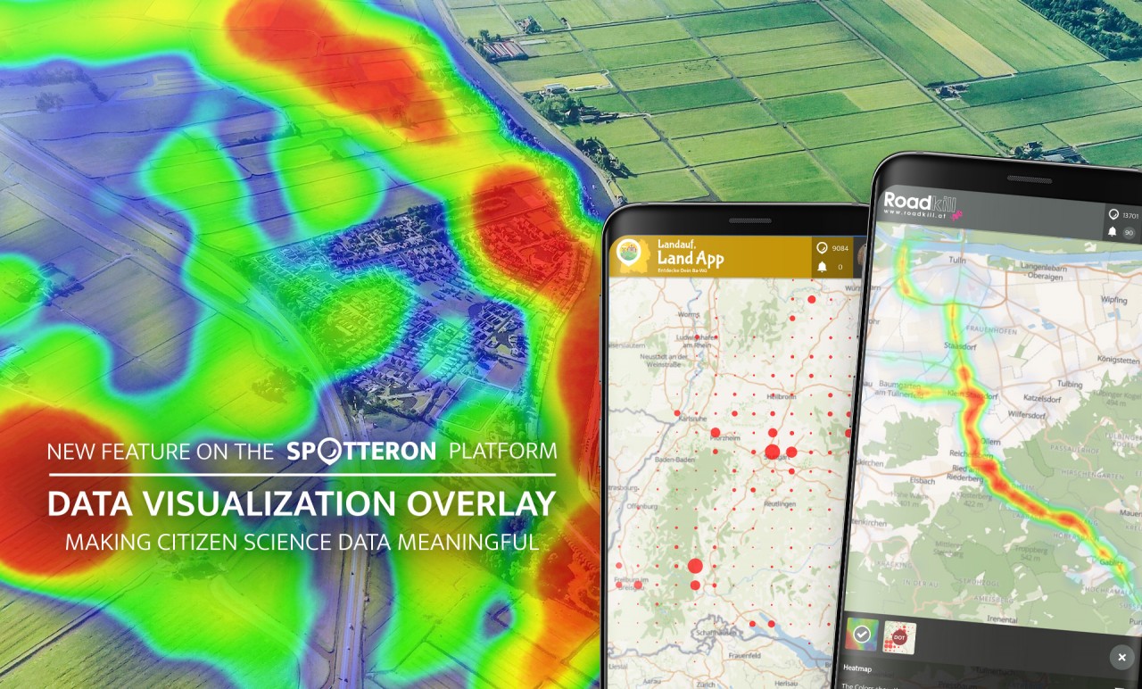
The new "Data Visualization Overlay" brings interactive data visualizations to all Citizen Science Apps on the SPOTTERON Platform. Significant relationships are illustrated with one click and presented in a visually appealing way.
Bringing Citizen Science Data to Life
Data visualization makes it possible to show relationships, patterns and trends in data and to gain new insights from them. It helps to communicate information clearly and efficiently, makes complex issues more understandable and is ultimately a fusion of scientific data and design.
By presenting data in its entirety, new insights can be gained. Especially in Citizen Science Apps with a spatial reference, visualizations directly embedded in the map offer the possibility of better understanding data and relating one's contributions to the whole data set of the project.

Example from the SpiderSpotter Citizen Science App running on the SPOTTERON platform: an area with many spots (left) and visualized with dot map and heat map (right).
To this end, we have now integrated a new interface directly into the map display for all project apps on the SPOTTERON Platform. The new feature can be activated at any time by tapping on the interface icon. This opens an interactive map overlay that displays the contributions in the project in the form of different data visualizations. The visualizations adapt seamlessly to each zoom level or to moving the map.
At the start of the new feature, there are currently already two types of data visualizations to choose from in all apps: a "Heatmap", which shows the density of spots in colour gradations on the map, and a "Distribution Dot Map", where the distribution of spots is resolved in a grid with the size of a circle representing the number of posts. But this is just the beginning - more extensive and complex overlays will be added here in the future.
Extendable and flexible: Custom Citizen Science Data Visualizations
The underlying extensibility of the new "Data Visualization Overlay" enables the implementation of new, individual data visualizations. As with the features for Citizen Science Apps, once implemented, all other projects can freely use new visualization options on the platform without additional development costs.
A first project-specific visualization can be found in the Citizen Science App "SpiderSpotter". In the project, spiders are observed to investigate the effects of climate change on their sizes and colours. Together with the University of Ghent in Belgium, we have implemented an interactive visualization of measurement data, that has been collected by Citizen Scientists in the project's specially developed data analysis tool on the map. The Citizen Scientists can thus become active on several levels in "SpiderSpotter" - from data collection to data analysis to researching measured values in their environment.
Future enhancements will include interactive elements that allow the display of specific species and their distributions and time-slider functionality to monitor changes over time.
The Technology of Data Visualizations in Citizen Science Apps
For providing a smooth and responsive functionality of the data visualization, we have set up a new web service on the SPOTTERON ICT infrastructure. This new service offers a flexible and performant backbone for quick and smooth data handling based on cacheing and indexing technologies. All projects on SPOTTERON can use this new infrastructure in their Citizen Science Apps right from the start and include live data visualizations in their projects.
