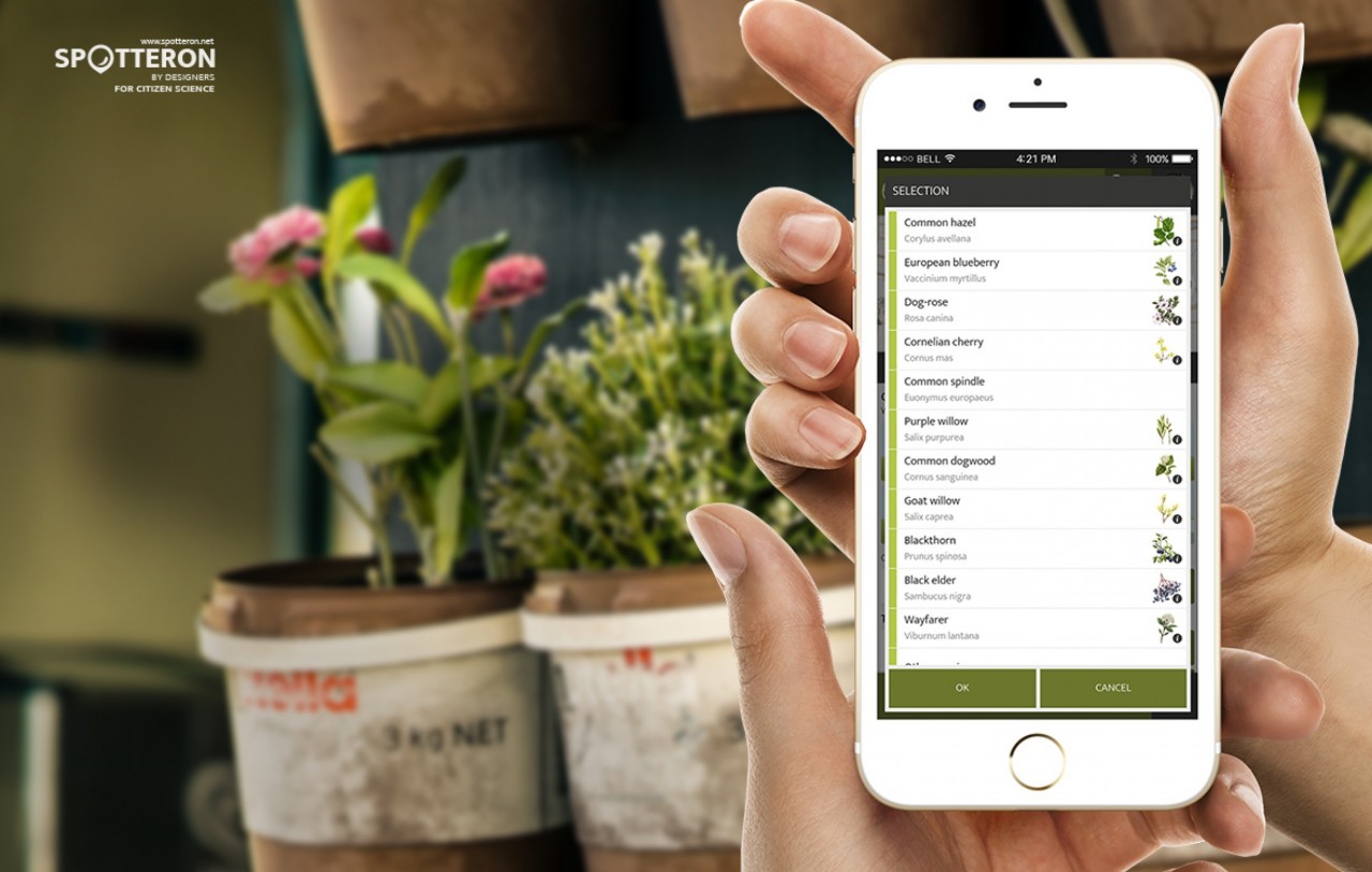
When developing a Citizen Science app, you can influence usability in many ways. But these crucial decisions can be decisive factors when it comes down to whether they enjoy using it and do so regularly.
The setup of a Citizen Science app can make a great difference
Throughout of more than five years of continously improving the SPOTTERON platform, we optimized our user interface to a point where it is as simple as possible while still delivering all data needed. But many factors are still very individual for every single project.
In general, looks really do matter. Attractive Design is an important factor (Emotion & Design: Attractive things work better), that we enjoy tackling with our long-standing experience in the field, but that's not everything yet.
It is often said, that you can tell a good restaurant apart from a bad one by the number of choices on the menue. If there are very many, it's quite obvious that not all ingredients can be freshly stocked und quickly preparted at all times.
Why people prefer a manageable number of choices
With Citizen Science apps, there are other reasons why we usually advise to rather keep it simple instead of overextending. On principle humans appreciate big varieties, but a list that is much too long can lead to exhaustion and disinterest. This phenomenon called "choice overload" was recently demonstrated in a study (1) by scientists of the California Institue of Technology (Caltech). It turns out that the human brain is not too excited about the additional expenditure of time which comes with large numbers of options. The interpretation of the research results suggests that a range of choices between 8 to 15 is optimal.
For these reasons it also makes sense not to give people an endless list of possible choices when it comes to Citizen Science apps. That could simply overextend users and ultimately lead to them submitting less data.
Of course we still leave final decisions on such topics to projects themselves, but it sure is good to know that science supports our recommendations.
(1) Choice overload reduces neural signatures of choice set value in dorsal striatum and anterior cingulate cortex
Elena Reutskaja, Axel Lindner, Rosemarie Nagel, Richard A. Andersen & Colin F. Camerer
Nature Human Behaviour volume 2, pages 925–935 (2018)
Interface Design in Citizen Science apps
For every project on the SPOTTERON platform we help to build a good and working structure of the project's data from a usability standpoint and put our interface design experience to use. Structuring a category tree which work well is an important task when planning a Citizen Science project.
Especially with the possibility to create hierarchical levels in the dialog for adding new observations, creating a structure which results in optimized selection lists is easy. With various elements, we are able to build a customized and tailored interface for your app, which can include selection lists along side with image buttons, which pre-filter a section of the project's data catgories - for example with pre-selecting "trees" in a phenology app users will just have the list of tree species to choose from as the next input step, not all species at once.
With around 15 selection options, the ideal amount of such a selection list is reached - if a selection list gets longer it is not catastrophic. But the longer it gets the more difficult it is for the Citizen Scientists to choose an option intuitively. As with many things in applied design, it's a reference value, not a strict rule.
Citizen Science Apps: "Nature's Calender ZAMG" - www.naturkalender.at, "Was geht ab?" - www.was-geht-ab.at
See live examples of Citizen Science apps on the SPOTTERON Platform
