New ways of Science Communication: Ars Electronica Festival 2023
The European Space Agency and its new way of communicating with the public
The climate crisis was one of the thematic focal points at the Ars Electronica Festival 2023, which took place in early September. The European Space Agency, whose observational data provides the basis for national and international efforts to predict future changes in climate, was also represented. In their presentations of the Climate Office and Beauty and Vulnerability - Earth from Space, held in Deep Space 8K at the Ars Electronica Center, Susanne Mecklenburg and Robert Meisner showcased not only their highly impressive and astonishingly alarming satellite images (such as the widespread forest fires in Canada and Rhodes this year) but, more importantly, their endeavors in effectively communicating this data.
ESA: Beauty and Vulnerability - Earth from Space, Ars Electronica Festival 2023, Robert Meisner
For instance, in portraying the decline of Arctic sea ice, the ESA has embarked on groundbreaking visualization efforts, particularly from a scientific perspective: Complex images become reduced, visually convincing and comprehensible graphics that can be communicated more easily and with greater impact. Susanne Mecklenburg emphasized the opening of science to the arts, with whom one now wants to find a common language to share scientific topics with society.
Simple graphics that can communicate
Ed Hawkins' graphic of the Warming Stripes went viral and is now a powerful image for the climate movement and is widely displayed. Encouraged by this success, it appears that institutions and scientists may be able to overcome their reluctance towards embracing popular and widely impactful visualizations, or even reconsider them. This is particularly evident, especially in the midst of the current climate crisis, where the communication divide between science and the public has fatal consequences. The lack of interest in the sciences among the general population is essentially generated by their exclusion; opening up to the arts and Citizen Science, likewise topics at Ars Electronica for the first time, promotes inclusion and thus forms a clear message of the Ars Electronica Festival 2023 ("Who owns the truth?).
British climate scientist Hawkins visualized his findings and data according to this principle: the graphics should be as simple as possible and start conversations about the warming of the world and the risks of the climate crisis. Hawkins explains that there is so much other information explaining details about how temperatures have changed. These graphics, however, fill a gap and allow communication and understanding even with minimal scientific knowledge. This is also how ESA will visualize its data in the future; to do so, ESA is opening up its data to artists to create what it calls "little pictures". Pictures that do not provide precise scientific information but give an impression of the situation. The "little pictures" will also be shown at the upcoming climate conference in Dubai.
The focus on the public in Science Communication
The conclusion is nothing less than this: science is prepared to embrace openness and allocate resources towards communication through Citizen Science and Open Science initiatives, as well as visualizations that transcend traditional scientific graphics. These efforts are centered on the broader population and society as a whole, with the aim of making knowledge accessible to everyone.
SPOTTERONs Infographic Package
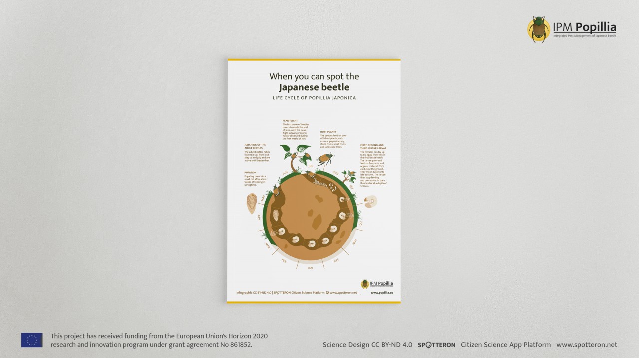
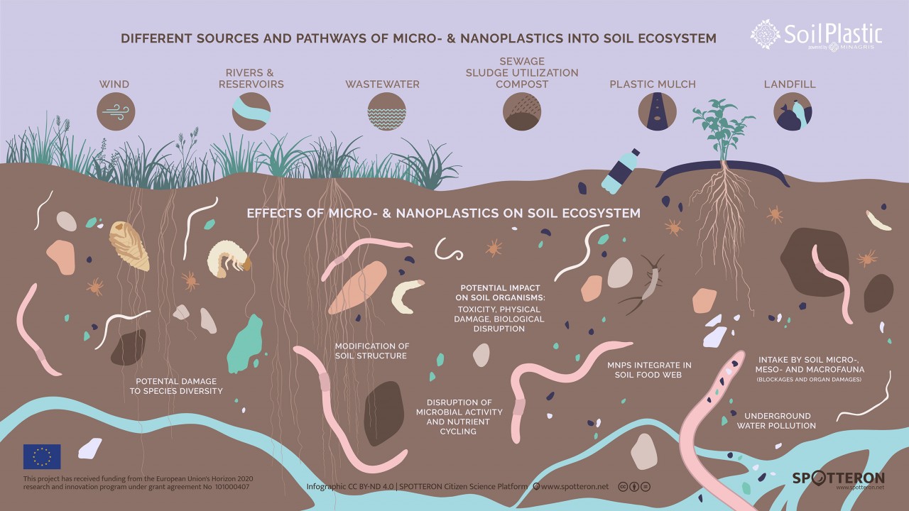
To actively support this movement, SPOTTERON will introduce an additional infographic package in the future. Through this package, we aim to visually represent the findings from scientific projects in graphics, facilitating communication with Citizen Scientists and the general public alike. Various types of data, important results, and information can be presented visualized within the Citizen Science App, during conferences, in presentations, on posters, and through social media. This approach enhances Citizen Scientists' engagement in the project and, simultaneously, simplifies communication with a broader audience.
Within this package, we seek to collaborate with the responsible researchers to visualize their data and foster the exchange of knowledge. This effort should not merely focus on data visualization but also involve considering the appropriate visual language to convey the desired image of the situation.
From graphics reminiscent of the Hawkins style to deliberately organic, multi-layered visualizations, the SPOTTERON team is fully prepared to embark on this journey. The infographic package will soon be made available. If you are interested, we would be delighted to engage in a conversation with you anytime.
Related Posts
Comments
By accepting you will be accessing a service provided by a third-party external to https://www.spotteron.net/


